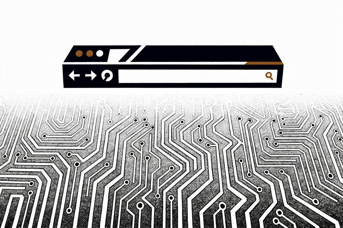
electron-tabs is a tab bar component for Electron renderer processes. Drop <tab-group> into your HTML, load the script, and you get a full tab strip backed by Electron's <webview> tag — with drag-and-drop sorting, badge support, and an event system.
Why I starred it
Building a browser-like UI in Electron is one of those things that sounds simple and isn't. The <webview> tag is the right primitive, but wiring it up with tabs, activation state, close buttons, and position tracking from scratch takes a lot of boilerplate. electron-tabs handles all of that.
What caught my attention specifically was the architecture choice: it's a genuine Web Component, not a jQuery plugin bolted onto the DOM. That decision drives everything else about how the library works.
How it works
The entire library lives in two files: src/index.ts and src/style.css. The TypeScript compiles to a single bundle via Parcel.
TabGroup extends HTMLElement directly and registers as "tab-group" via customElements.define. The constructor reads its configuration from HTML attributes:
this.options = {
  closeButtonText: this.getAttribute("close-button-text") || "×",
  newTabButton: !!this.getAttribute("new-tab-button") === true || false,
  sortable: !!this.getAttribute("sortable") === true || false,
  visibilityThreshold: Number(this.getAttribute("visibility-threshold")) || 0
};
That means you configure it declaratively in markup — no separate init() call needed.
The Shadow DOM is the interesting part. createComponent() calls this.attachShadow({mode: "open"}) and builds the entire nav + views structure inside it. The bundled CSS is injected as a <style> element inside the shadow root using Parcel's bundle-text: import:
import styles from "bundle-text:./style.css";
// later:
const style = document.createElement("style");
style.textContent = styles;
shadow.appendChild(style);
This is how the component can exist on any page without its styles leaking or being overridden by the host stylesheet — which is the correct behavior for a reusable UI component. If you need to customize styles from outside, you inject a <style> tag inside the <tab-group> element and connectedCallback() picks it up and moves it into the shadow root.
The active-tab tracking is worth noting. Rather than maintaining an activeTab property, TabGroup keeps the active tab at index 0 of this.tabs. setActiveTab() removes the tab from its current position and unshifts it:
setActiveTab(tab: Tab) {
  this.removeTab(tab);
  this.tabs.unshift(tab);
  this.emit("tab-active", tab, this);
}getActiveTab() is then just this.tabs[0]. It's a simple trick that lets activateRecentTab() — called when you close the current tab — trivially grab the next most-recently-used tab.
The close() method on Tab uses AbortController to implement a cancellable close event:
close(force: boolean) {
  const abortController = new AbortController();
  const abort = () => abortController.abort();
  this.emit("closing", this, abort);
  if (this.isClosed || (!this.closable && !force) || abortSignal.aborted) return;
  // ...proceed with removal
}
You can listen to "closing" and call abort() to prevent the tab from closing — useful for "unsaved changes" prompts.
Drag-and-drop sorting is handled entirely by Sortable.js, initialized in initSortable() on the tab container div. No custom drag logic.
Using it
Basic setup in the main process:
new BrowserWindow({
  webPreferences: { webviewTag: true }
});
In the renderer HTML:
<tab-group new-tab-button="true" sortable="true"></tab-group>
<script src="node_modules/electron-tabs/dist/electron-tabs.js"></script>
<script>
  const tabGroup = document.querySelector("tab-group");

  tabGroup.setDefaultTab({
    title: "New Tab",
    src: "app://./index.html",
    active: true
  });

  const tab = tabGroup.addTab({
    title: "Dashboard",
    src: "app://./dashboard.html",
    active: true
  });

  tab.on("closing", (tab, abort) => {
    if (hasUnsavedChanges()) abort();
  });

  tabGroup.on("tab-active", (tab, tabGroup) => {
    document.title = tab.getTitle();
  });
</script>
Rough edges
The README opens with "electron-tabs is discontinued." The last real commit before the discontinuation notice was a bug fix for getTabByRelPosition from a community contributor — the maintainer had checked out. The latest version is 1.0.4, and it hasn't moved since.
The event system wraps the native CustomEvent / EventTarget API with thin helpers (emit, on, once in src/index.ts), but the ergonomics are a bit awkward — event listeners receive e.detail spread as arguments, which isn't obvious from the outside.
There are no tests. Zero. For a UI component with non-trivial state management (tab ordering, active-tab tracking via the unshift trick, position arithmetic), that's a real gap. The getPosition() implementation in particular — walking previousSibling in a loop — reads the DOM directly rather than tracking state internally, which will be slow if you have a lot of tabs.
The webviewTag: true requirement is worth flagging: Electron's own docs recommend against it in most cases because it expands the attack surface. electron-tabs is designed for this scenario (it's essentially a browser shell), but you need to understand what you're opting into.
Bottom line
If you're building an Electron app that needs a browser-style tab bar, this saves you a few days of work — even abandoned. The Web Component architecture is clean, the Shadow DOM isolation is correct, and the API covers 90% of what you'd want. Just don't expect updates or community support.